Optical Toy Workshop
Posted: August 31, 2012 Filed under: Announcements | Tags: #lenticularimage #thaumatrope #zoetrope Leave a commentHi Everyone
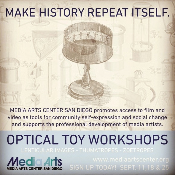
Just wanted to let you know that Im teaching OPTICAL TOY workshops at Media Art Center San Diego for the month of September. Make history repeat itself with toys from our past! Make your photos move with lenticular images, thaumatropes and zoetropes! Join me for this fun workshop and take home your very own device 🙂
Posted: August 30, 2012 Filed under: Project 1 1 Comment
Great example for emphasis, also works for complimentary colors. Awesome.
Posted: August 30, 2012 Filed under: Project 1 Leave a comment
For you gamers out there, a very sweet font.
Posted: August 29, 2012 Filed under: Project 1 Leave a comment
Great example. Great use of shape and contrast.
This is such a cool and interesting design for a small space. But it is kind of eye-exhausting instead of mind-relaxing.
I really liked the colors all together. Even if they are black and white against color, they make a good combination.

Posted: August 29, 2012 Filed under: Project 1 1 Comment
Great job, your understanding is very clear!
Posted: August 29, 2012 Filed under: Project 1 Leave a comment
I think removing the color helped bring out more of the lines, which in my opinion, is the most important part of the image. Good!
well as you can see i decided to make the image black and white. all i really did was mess around with the brightness and the Black and white. I think my
editing was successful because the black and white really makes the lines stand out and it makes the image easier to see.
Posted: August 29, 2012 Filed under: Project 1 Leave a comment
Wow what a transformation! Lots of layers and filters going on here. It completely changes the images from their original state. Great!
I like the second one more (all black and white) because the image blends so well together and it makes it seem like I only used one image but in reality I used more than 3. Also it creates such a unique design that it could be easily use for a poster or t-shirt.
Posted: August 29, 2012 Filed under: Project 1 Leave a comment
Interested use of shape with variation, great!
